Copy Artwork Assignment
Aka: The Plagiarism Assignment
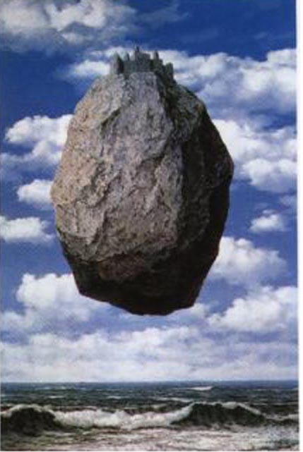
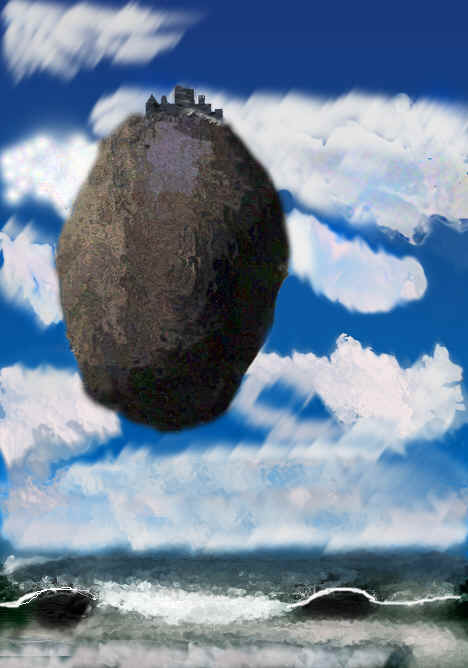
The Original My Copy
I found my picture on the Internet. I chose it because it looked like fairly easy shapes but not an easy picture because of the textures. I saved the picture and set up Photoshop to show my canvas and the picture side by side. I started by creating the rock using the ellipse tool and filled it with just a dark gray to start with. Then using the airbrush tool and black paint I shaded the right side to imitate the shadowing. Then I used the tan and darkened it to try and match colors in the middle left section. Unfortunately the colors didn’t match perfectly and I would have prefered to use the eyedropper. Then I lightened the color more and used the airbrush to insert lighter overtones in the upper-left-hand corner. I saved the rock as its own layer and created the background on a new layer. For the background I tried many shades of blue using the gradient tool to create the color light at the bottom and darker at the top. I had to try many different shades because the original picture doesn’t get very light at the bottom. It changes slightly.Using the airbrush with some light gray colors, I just lightly painted some areas. I couldn’t match the clouds very closely because they are so detailed. I used the fade button to help create the light "blurry" effect. I then used different filters to create textures on the rock. I used different settings like wave, texture, distort and zigzag to give it shape and look more random and rough. I didn’t focus on making the details match I just tried to make them overall both look like rocks. I used blur and wave and ripple to add texture to the clouds and make them not so "square". Using straight lines and the grid, I created the castle just following the general shapes. I used the airbrush to create shadow lines on it. I then used a filter in texture that makes it look like it has divots so the color wasn’t solid. The ground was hard because I couldn’t get a filter to make the colors meld in horizontal lines and still look somewhat rough. I used ripple and zigzag but it turned out really blurry on the printout.