|
| Credit for the inverted pyramid image
on this page goes to: Tango Connect. To visit the page this graphic
was located at please click here,
but note the following:
By clicking on one of these links you will be
leaving this site. Eastview High School, The Lightning Press, nor
District 196 can take responsibility for the content published on
other websites. |
|
 |
|
All newspapers follow specific guidelines to layout and
design.
Below is a list of some of the things that Lightning
Press writers consider when writing a story and some
factors Lightning Press editors consider when putting together
a page.
For a list of newspaper terminology,
click here.
The
Lightning Press recommends that students interested in journalism
enroll in Journalism A and B |
|
|
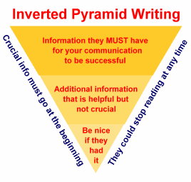
Inverted
Pyramid Writing |
| Writing a newspaper article is different than writing a
five paragraph paper for English. Readers of a newspaper want
to get the most important facts first. They may not even
continue reading past the third paragraph or so. That is why
writers must give the 5 w's (who, what, where, when, etc...)
in the first paragraph or two. |
 |
|
Also keep in mind that if someone opens up their page and sees
a lengthy paragraph, they are not likely to read the article.
Instead of long paragraphs, include many short and to the point
paragraphs. Start a new paragraph each time a new quote is
added or new information is added. |
|
|
Modular
Design |
|
All stories
(and anything accompanying stories, like photos or
graphics) are designed in rectangular shapes.
The entire
page of a paper is made up of rectangles.
Pages
should have both copy (articles) and graphics—a text heavy page is not
inviting to most paper readers.
|
|
|
Headlines,
Decks, and Bylines |
|
Headlines look good in different
fonts, they should be LARGE, attention grabbing, and creative.
Headlines should in BOLD and above
the entire story (not just one column) or beside it.
Decks are the “sub-headline”
in a smaller version of the same font. They should NOT
be BOLD, but they may look good italicized.
Bylines include the name and
credentials of writer—name is 12 pt. font normal and
credentials are on the next line in 12 pt. italicized:
| Headline |
| Deck Sample |
|
| by Joe Schmoe |
| Lightning Reporter |
|
|
|
|
Columns
and Spacing |
|
A standard page has four columns. Stories should not
stretch across multiple columns and columns should not vary in
width.
Newspapers usually do not look good when they have big gaps
of white space. A little extra is not a problem so long
as it does not look as if it blends two different
stories together. If it does a line can be used to separate
the two articles. Lines should not meet with text as they
are only a frame, and should be used sparingly. |
|
|
Photographs,
Cartoons, and Graphics |
- EVERY
photograph must have a caption AND a photo credit
(Photographer: Joe Schmoe)
- Caption
has a bold
catch-phrase, then a colon, and then the caption in
normal 12 point Times New Roman font
- Avoid
the postage stamp/business card size art—don’t be
afraid to supersize photos and cartoons, these are the
elements that pull readers into a story—make them
attention getting!
- Crop
photos! Only
include the center of attention
-
Every
picture needs a person in it!
|
|
|
Pull
Quotes and Text Wrap |
|
A pull quote is a
quote from an article that is "pulled out" and enlarged
to add visual interest. Text wrap is when a word is relocated
to the next line because it is too big to fit on one line.
These elements can be used to lengthen or shorten the size of
a story.
|
|
|
Shading
and Boxes |
|
Creatively placed boxes and use of shading can add an extra
visual appeal to a page. They can be used to highlight a
special message or simply to make a page look better. Shading
should be used lightly enough around black text to preserve
clarity.
|
|
|